I generally use the best practice of having more than one logo to visually present my client’s businesses.
A logo variation is a version of your logo that you use in specific situations: sometimes due to size or to vary the look. It’s almost impossible to design a “one size fits all” logo and to be really honest, it doesn’t have a lot of strength and character in your materials that way.
Why? You never know what you might put it on! A giant banner in horizontal format is much different than a small business card or the square profile photo of a business social media page. When designing, I take into account these variations, backgrounds and colors.
Space considerations and background color dictate the design choice. A light-colored logo always looks better on a dark background and likewise, a dark logo looks better on a light background.
A “wide” logo might fit well on an invoice or horizontal banner/sign. A “tall” design might fit well on a Facebook or Instagram profile photo. An “icon” style can be used on a sticker, baseball cap, stamp, website or a lot of other fun things that would look cumbersome with the full logo. A “one color” or “all black” is useful for other things like screen printing or going “over” imagery of a photo (white or black).
Does it take more effort to create these? Yes! But it’s also an incredibly flexible way to advertise your brand and really make your marketing bad ass. As we all know, first impressions are everything. Your logo should be your favorite piece of the pie.
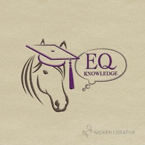
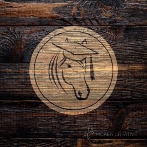
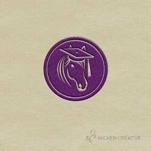
Here’s some great examples of a “primary” logo and “variations” for my client EQ Knowledge. The components change according to the need:


